
Task Objective: Data Visualisation Workshop
Building upon the dataset generated in workshop 4, the objective is to visually present the data we collected.
My Objective (Self-Initiated Work)
Last week, we played the role of data collectors, gathering survey responses on how students use Generative AI within the university. My objective for this workshop was to take our raw dataset and apply the principles of data visualisation to find the story hidden in the numbers. I had the option to use tools like Excel/Tableau for this task.
the data we got back was...messy
Looking at the raw export, the gap between designing a survey and analyzing the results is massive. Here are my key reflections on the data we gathered and the immediate ethical panic I experienced upon opening the Excel sheet.
- The Anonymity Failure: The first thing that jumped out wasn't an insight about AI, it was a name. Despite our bold claims that our survey's responses would be anonymous, the very first row of data included a full name.
This is a critical failure in our privacy-by-design approach. Even though we didn't ask for personal identifying information, we didn't account for user behavior (users auto-filling their details) or the metadata captured by the system.
Furthermore, making our survey form multilingual to make it more accessible to the Chinese students in the class, explicitly recorded users' browser settings. So we had a whole new column called "Language" with multiple entries showing "Chinese (Simplified)" or "English (United States)".
- Tool Preferences: Once I got past the privacy scare, the data revealed a fascinating hierarchy of "acceptable" AI.
The "Safe" Tools: There is a strong consensus around Grammarly and Chat GPT. Most rows show "Agree" regarding comfort with this tool. It seems students view this as a literacy aid, not "cheating."
The "Niche" Tools: Copilot received a lukewarm reception, with several "Neutral" or "Disagree" responses. It hasn't permeated the student workflow yet.
The "Essential" Tools: For the respondents who identified as International Students (or whose browser language was Chinese), there was a correlation with high comfort in Live Translation tools. This validates our hypothesis that for many, AI is an accessibility layer, not a shortcut.
Challenge: I initially tried to rely on the auto-generated visualisations in Microsoft Forms, but quickly hit a wall. The tool presents data into donut charts and diverging stacked bars that are notoriously hard to analyse accurately. The solution was exporting the raw data into Excel. This allowed me to build visualisations where I had total control over the axes, variables, and narrative.
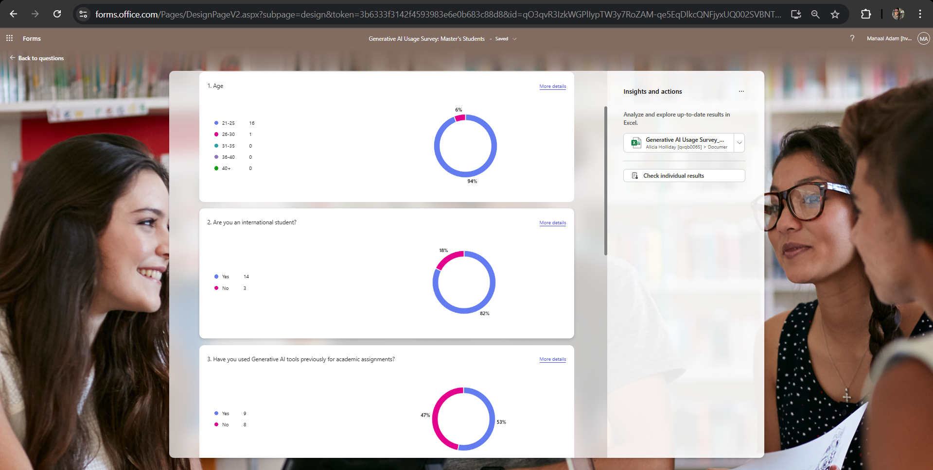
Figure 1.1: A snapshot of Microsoft Forms' default data visualisation in the form of donut charts.
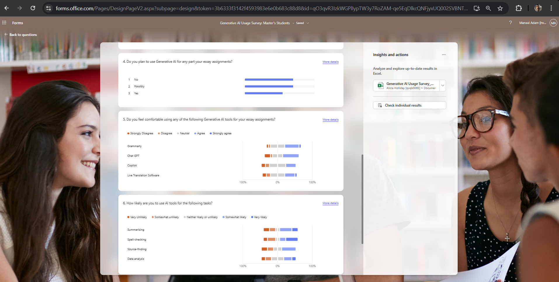
Figure 1.2: A snapshot of Microsoft Forms' default data visualisation in the form of diverging stacked bar charts.
The Art of Data Noise Reduction
The core challenge in data visualisation isn't drawing a graph, it's deciding which data points not to show. Data cleaning took up almost as much time as the visualisation itself. I learnt that poorly presented data can be actively misleading, regardless of how fancy the chart looks.
I underestimated how much time goes into cleaning data.
While data visualisations for research are expected to be purely factual and serious, plainly presenting only evidence and hard data often fails to engage the audience.
"Nonfiction that doesn’t let us hear the human interaction tends to lose readers" (Cheney, 2001, cited in, Feigenbaum and Alamalhodaei, 2020).
Ultimately, most people prefer narratives over mere statistics. The use of data visualisations facilitates rapid comprehension of information while offering the ease of detecting previously unnoticed trends within the dataset (Ware, 2019, cited in, Tsang, 2023).
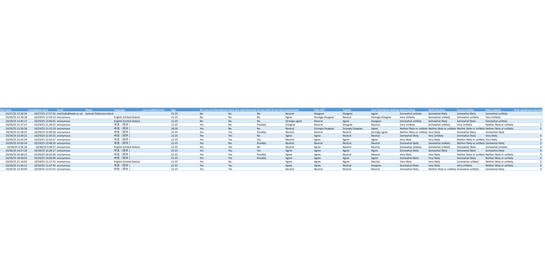
Figure 2: The "messy," raw data exported to Excel for easier visualisation.
bringing the data to life
I transformed the total collected data of 16 students in Excel into a numerical format, utilising a five-point Likert scale where 1 represented the lowest extremity (Very Unlikely/Strongly Disagree) and 5 represented the highest (Very Likely/Strongly Agree).
The analysis was conducted in two distinct stages of visualisation. First, individual clustered column charts were created for Grammarly, ChatGPT, Copilot, and live translation software.
These charts visually compared student responses on a 1–5 scale to assess tool-specific usage or attitudes.
Second, a single clustered column chart was developed, specifically highlighting the tasks students reported being least and most likely to use AI for.
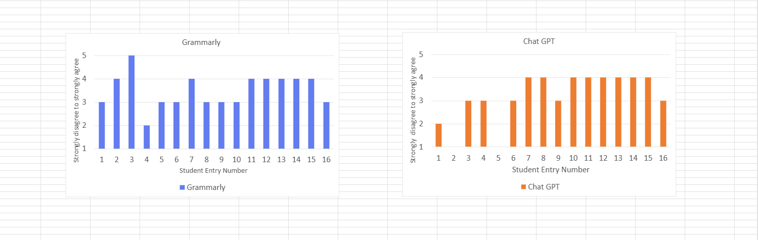
Figure 3.1: Individual breakdown of student entry data (1–16) assessing attitudes toward Grammarly and ChatGPT, using a Likert scale.
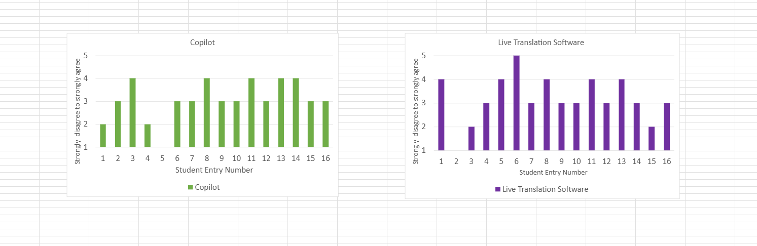
Figure 3.2: Individual breakdown of student entry data (1–16) assessing attitudes toward Copilot and Live Translation Software, using a Likert scale.
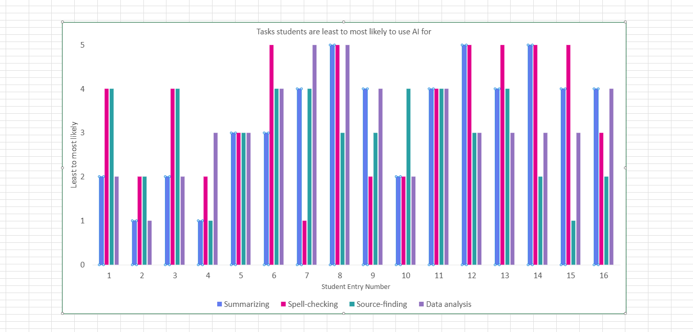
Figure 3.3: Comparison of student probability to use AI tools across four key academic tasks: summarizing,spell-checking, source-finding, and data analysis
From the above visualisations, it is now easier to compare various AI tools and the students' attitudes towards them. Furthermore, by isolating the specific tasks where students are most prone to rely on AI, the data highlights academic areas where the university may need to intervene with additional support and resources.
References
- Feigenbaum, A. and Alamalhodaei, A. 2020. The Data Storytelling Workbook [Online]. Routledge. [Accessed 23 November 2025]. Available from: https://www.perlego.com/book/2194057.
- Tsang, S.J. 2023. Communicating Climate Change: The Impact of Animated Data Visualizations on Perceptions of Journalistic Motive and Media Bias. Journal of Broadcasting & Electronic Media. 67(2), pp.1–22.