
Task Objective: Acknowleding the feedback
This workshop was all about troubleshooting and, crucially, cross-referencing our work with the actual assessment brief. We must also acknowledge all the feedback given by our colleagues from the previous demonstration workshop.
My Objective (Self-Initiated Work)
As Project Lead for Picture-Perfect, my personal goal for this session is to enforce academic traceability. It is easy for a creative artefact to lose its theoretical grounding once you start coding or designing. I also decided to lend a helping hand to the Practice Leads as we are designing an interactive website and neither of them are used to coding. Additionally, I will update Page 9 of our shared Action Plan with strict internal deadlines and a clear division of work for the Easter Holidays.
Analog architecture for a digital build
I first pulled up Page 9 of our shared Action Plan and mapped out the remaining weeks, as the dealine for submission was closing in. Then we discussed and assigned specific, internal submission dates for different parts of the work, dividing the remaining work clearly between the Research team (Danny and Fia) and the Practice team (Jude and Meggie). Establishing this timeline was slightly stressful, but it provided a much-needed safety net for the weeks ahead.
With the timeline set, we needed to know exactly what we were building. To do this, we returned to our favourite methodology: pen and paper.
We began drawing a massive flowchart of our entire website.
Key Aim: We had to meticulously chart the mechanics of our artefact: If a user clicks this button, where does it lead? What design elements and text populate that specific page? How does the navigation fundamentally change as the user goes deeper?
What the flowchart helped us achieve
This flowcharting exercise was crucial for realising our core theoretical concept. If our website is meant to simulate the descent into an algorithmic echo chamber, the navigation itself must become part of the narrative. By mapping the site on paper first, we could physically see how to structure the trap. We designed the early pages to have multiple external links and open navigation. But as we mapped the deeper pages, we consciously removed navigational options, forcing the user down a single, radicalised path.
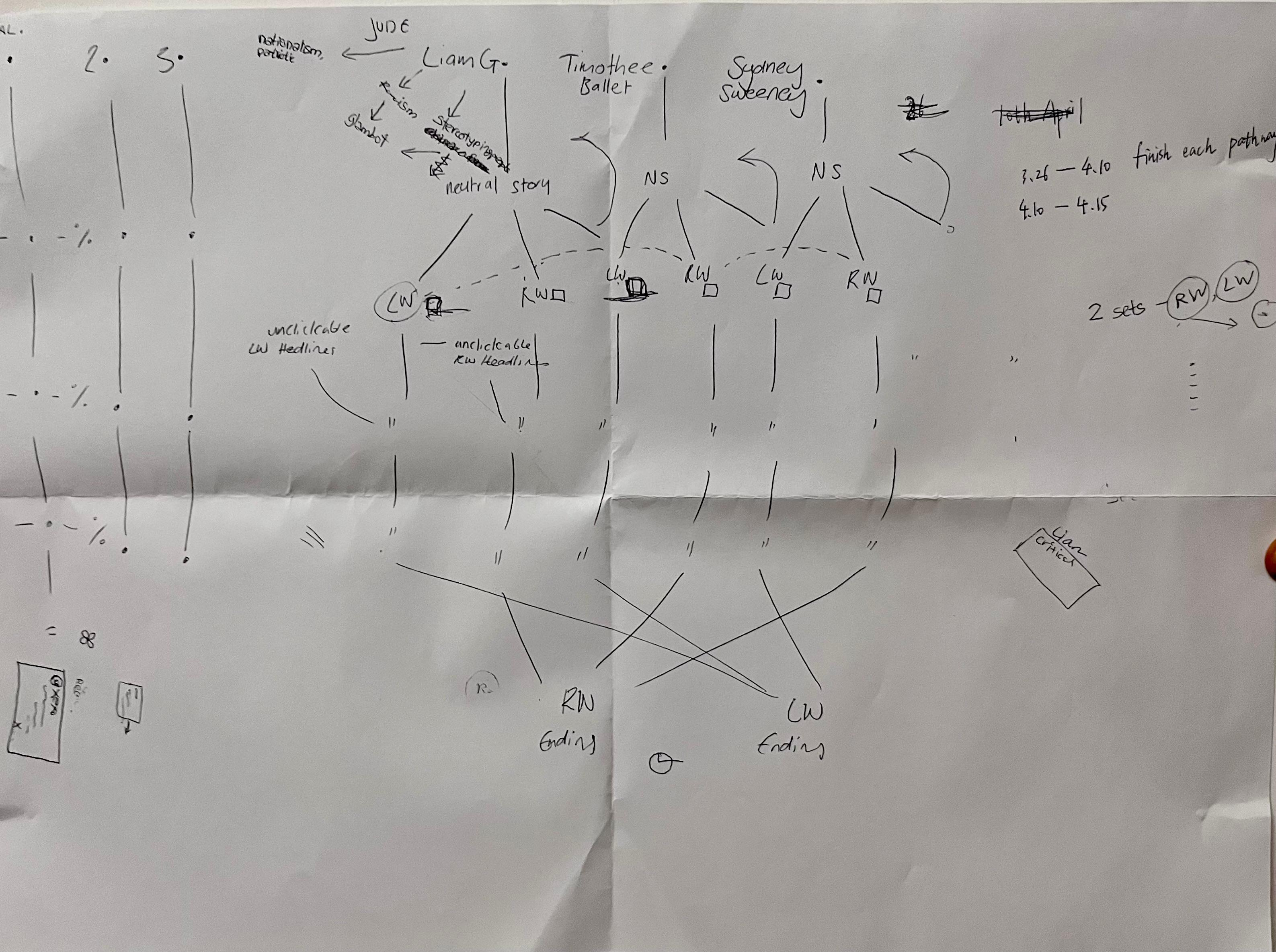
Image 1: Image of the flowchart we developed to navigate our interactive website.