
Task Objective: Meet and greet the group
-
Sensing foods:
Examine a plate of sweets using five senses of the human body. Try to describe it to others in the group.
- Digitalising non-visual data: We were tasked with walking through the Charles Thackrah building, mapping the space entirely through touch, sound, or smell, and then figuring out how to digitise that non-visual data.
My Objective (Self-Initiated Work)
Conspiracy theories and digital radicalisation are deeply visceral. They make people feel anxious, paranoid, or overly stimulated. My goal during this digital mapping phase was to figure out how we could capture that feeling. Instead of just making a standard visual map of our research, I wanted to experiment with how audio trails or chaotic soundscapes could represent nature of being trapped in an algorithmic echo chamber. It was a crucial reminder that if we want our final project to accurately critique how digital media shapes belief, we have to design for the whole sensorium, not just the eyes.
How to describe a marshmallow to your friend
If you had told me a year ago that a core part of my Digital Media Masters would involve sitting around a table examining a plate of sweets, I wouldn't have believed you. Yet, there we were. Kaajal and Holly provided each group with a plate of snacks, marshmallows, chocolate eggs, sour gummy worms and a tangerine. They tasked us with conducting a sensory audit before we were allowed to eat them.
At first glance, it felt like a primary school exercise, but it was actually a highly effective crash course in sensory ethnography. We tend to prioritise the visual in digital media such as what a website looks like, the text on a screen, completely ignoring the other four senses that make up human experience.
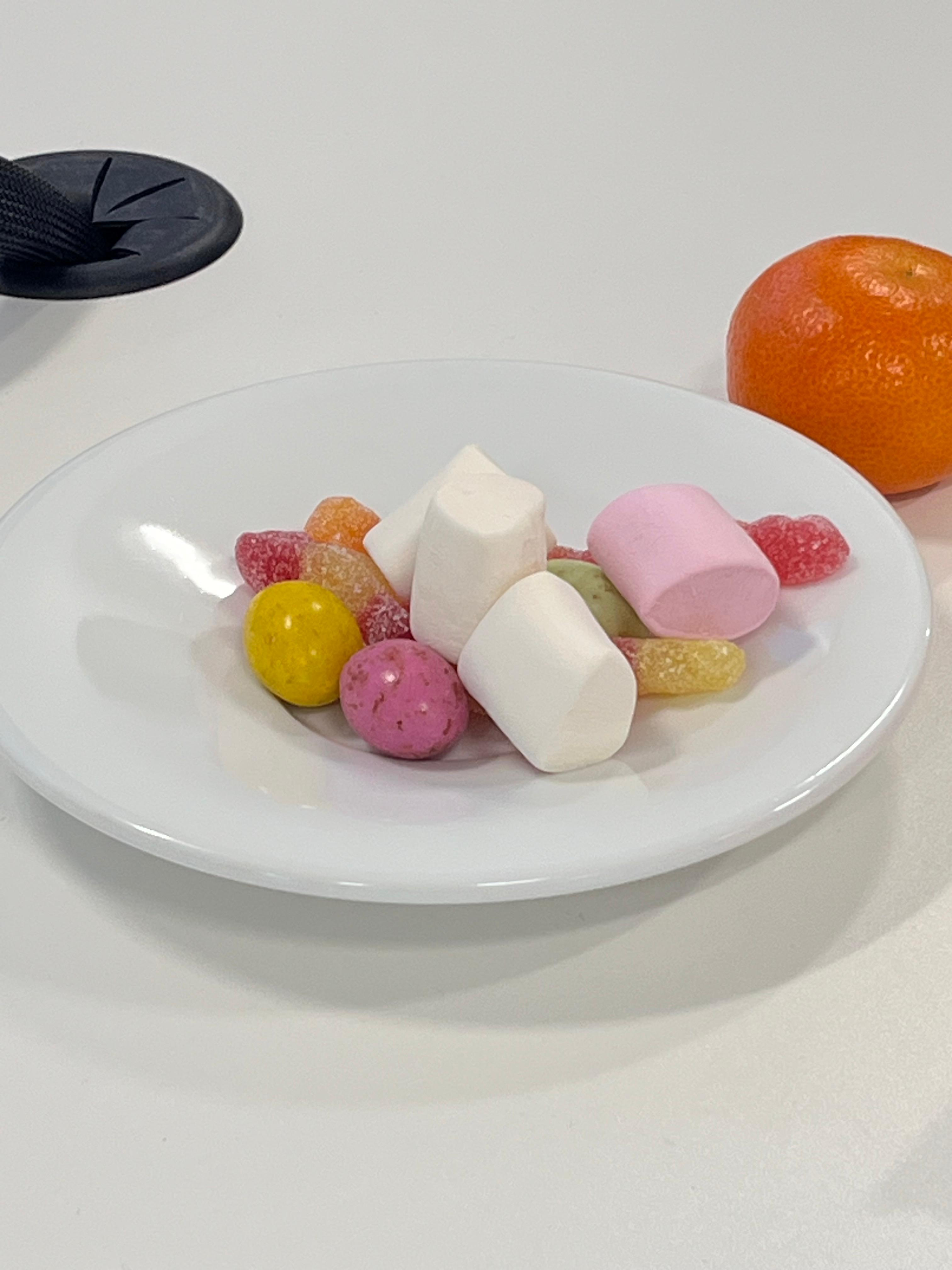
Image 1: An image of all the snacks we were given.
Fia and I picked a marshmallow to examine. It was pink, fluffy and soft to touch. It smelled warm and sweet. It looked like a chunk taken off a cloud. Meggie picked the chocolate egg. She described it to be hard and it did not smell like anything in particular. Danny and Jude picked the sour worms. They considered it sticky to touch and the salty and sugary particles got on their fingers. It also smelled fruity. Later on, I also tried the tangerine. It was mostly smooth to touch and looked like an orange ball. It smelled cSnacksSensory Videoitrus-like.
Key Insight: By breaking down the physical sensation of eating a sweet, we realised that our digital artefact needs to replicate this emotional bait-and-switch. If we want to map the experience of propaganda, we can't just rely on text. We need to design an environment that feels initially inviting but becomes increasingly uncomfortable.
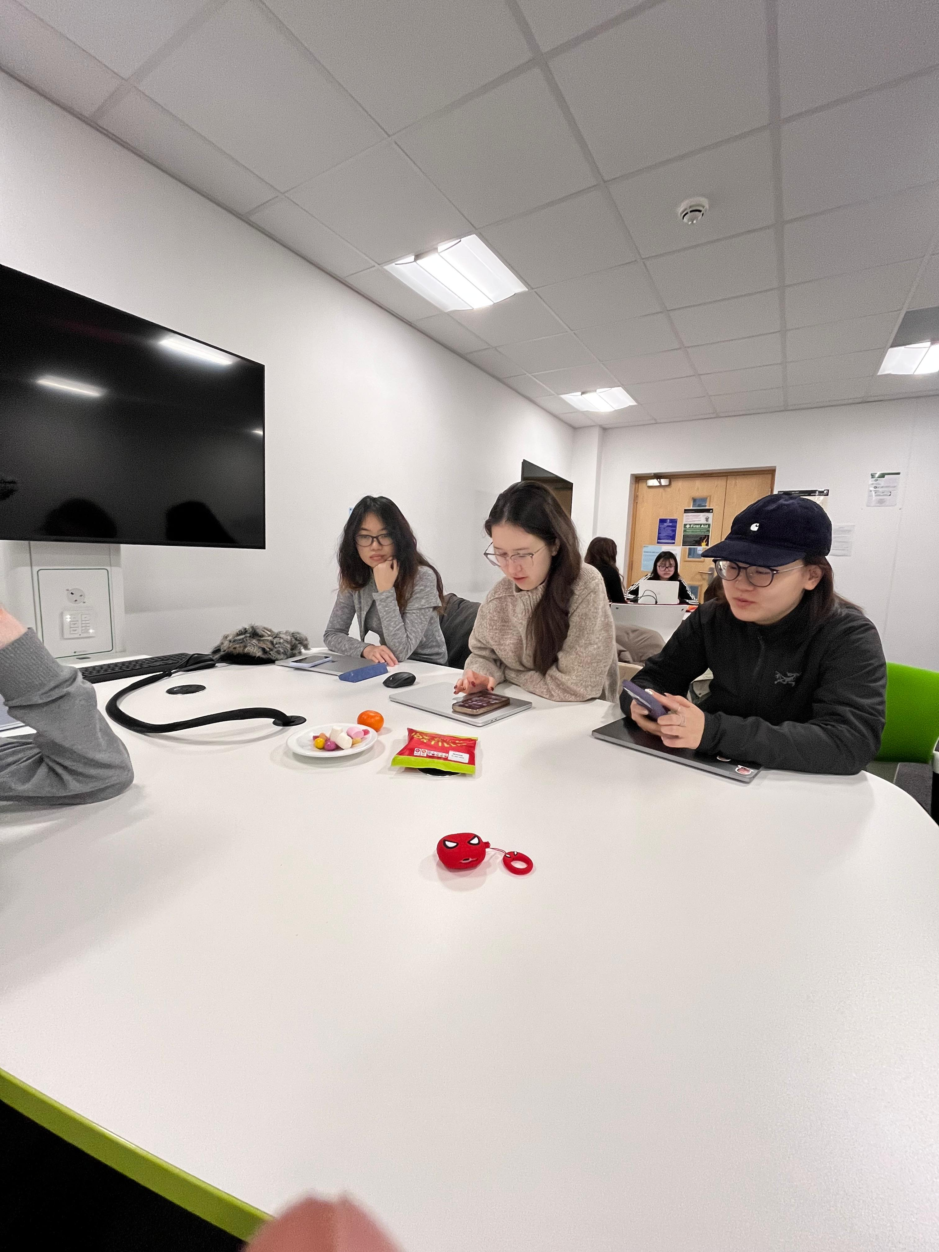
Image 2: An image of all of us snacking, I mean, examining the snacks :)
Visualising without your vision
For the second half of the workshop, we finally left the classroom to put theory into practice. Our task was to walk around the Charles Thackrah building, but with a catch: we had to map our surroundings using only one isolated sense, effectively turning off our reliance on vision.
Navigating a familiar university building purely through sound, the texture of the walls, or the ambient smells of the corridors completely shifts your spatial awareness. It forces you to notice the background noise of the environment that our brains usually filter out.
How do you put a smell into a digital portfolio?
As a group, we had to get creative with our data digitalisation. Sound was the most direct translation, captured through raw audio recordings. Smell was translated visually, assigning specific colours to represent the olfactory experience of different zones in the building. Touch was represented through captured images of physical textures.
The Final reveal
Jude, acting as our Practice Lead, took on the impressive task of compiling these disparate data points, colours, textures, and audio files, into a single, cohesive visual video. This is where I managed to achieve my self-initiated objective of embodying the data. During our sound mapping, we recorded the automated female voice from the building's lift. Instead of just playing the raw audio, I filmed a cameo of myself lip-syncing the words "doors open" directly over the lift's audio track. It was a small, humorous addition, but it worked perfectly. When we presented our video to the class, everyone genuinely appreciated the creative digitalisation of our data. It was more than a map, it was an engaging multimedia artefact.